
Does Infrastructure Correlate with Learning Outcomes?

The issue of infrastructural inputs in the functioning of schools is intensely debated in the educational circuits. India with its vast diversity is a host to over 1.5 million schools across the country. The infrastructure varies from one classroom, one teacher, many students to some of the finest facility schools. They are comparable with the best in the world, with handsome teacher taught ratio.
It is unfortunate but true that even after 70 years of independence most of the schools lack even the hygiene level infrastructure. When we talk of good infrastructure, the connotation invariably is that of a glossy building, posh corridors, ostentatious facilities, outsourced canteens and five-star gymnasium. However, seen in the contextual reality of India, ensuring a necessary support system comprising well-lit classrooms, library, laboratories, provision for co-curricular activities and sports, clean drinking water, toilets for boys and girls is mandatory. Any addition to this is a plus but not a guarantee for better learning outcomes.
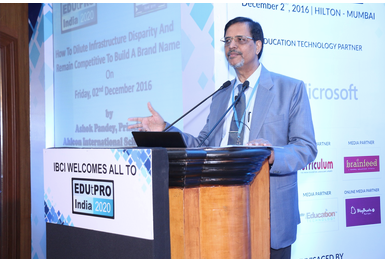
In a conference organised by EDUtPRO INDIA 2020 in Mumbai recently, I was invited to speak on the subject of infrastructural disparity and building a brand institution. I have rested my case on infrastructure in the preceding paragraphs. I have argued for a very long time that schools are built with the help of many other important capitals. I list them as intellectual capital based on the competency and scholarship of teachers, moral and ethical capital determined by the culture and value system of the organisation. Another essential ingredient of a great institution is the leadership capital, defined by vision, mission, core values and accountability quotient.

We all agree that holistic education encompasses imparting knowledge, teaching the art of living, imbuing exploration and creativity and above all offering a fulfilling experience to the students. These aspects of holistic education give further insight if we look at what the young learners aspire to do beyond school. We have to prepare them for college and life. They have to fit culturally in the organization, exhibit poise, and respect and add value to the organisational endeavours.
We, therefore, need to revitalise our institutions by demonstrating commitment, focusing on the right means for good outcomes and developing a trust mark rather than a trademark. We can reach the hearts and minds of the students and parents only by creating a space where the services that we provide match the expectations that they have. Differentiation is the key in our classrooms, and therefore schools must respond to address the individual needs and aspirations. Parents are the key stakeholders and schools must develop a mechanism for obtaining feedback from them. The leadership of the great institutions does not shy away from asking some tough questions to themselves. Some of these issues are:
What are our function and purpose?
How are we unique?
What is our larger vision?
Are we preparing our students for life?
Are we offering more value for the investment made?
The answer to these questions lay the ground for us to operate, design our curriculum, adapt new pedagogy and win the trust of the learners. Only then we can have the edge over the others and be innovative. Branding, in my opinion, is not about catchy phrases, glossy photographs, beautiful website and logos; it goes deeper than that. And that means there should be no mismatch between the promises we make and the services we deliver.


I clicked on 91 club just to check it out after hearing others mention it; I didn't read every single word, but mostly just browsed the interface and layout. The site is easy to follow, with straightforward headings that let you instantly grasp the topic. The brief introduction to Études—highlighting their blend of creativity and functionality in architecture—was concise enough for me to get the gist even while skimming. I like the scrolling layout where content is broken into distinct blocks rather than being crammed with text, which makes it much easier on the eyes. Navigation is smooth and intuitive, and the "Commitment to Innovation and Sustainability" heading stands out clearly within the layout.
Khi đọc các nội dung giới thiệu trực tuyến, tôi thường để ý cách bài viết dẫn dắt trước khi nhắc đến nền tảng chính. Trong bài này, phần nói về Kuwin được đặt sau đoạn mở đầu nên mình thấy khá dễ theo dõi. Cách sắp xếp đó giúp thông tin xuất hiện tự nhiên hơn và không làm người đọc có cảm giác quảng cáo quá sớm. Nội dung còn lại chủ yếu tập trung vào trải nghiệm sử dụng, giao diện và các danh mục giải trí quen thuộc. Nhìn chung cách viết khá rõ ràng.
TR88 mình cũng kiểu nghe người ta nhắc nên bấm vào xem thử cho biết thôi. Không có ngồi đọc hết nội dung đâu, chủ yếu lướt giao diện với cách họ chia phần. Thấy trang làm khá dễ theo dõi, mấy tiêu đề đặt thẳng thắn nên nhìn cái là đoán được chủ đề đang nói gì. Có đoạn giới thiệu về Études viết ngắn gọn, nói họ kết hợp sáng tạo với chức năng trong kiến trúc nên mình đọc lướt vẫn nắm ý. Mình thích kiểu cuộn xuống là từng khối nội dung tách riêng, không bị nhồi chữ, nhìn đỡ mệt mắt. Phần điều hướng cũng ổn, chuyển qua lại không bị rối, nhất là heading “Cam…
Thấy mọi người bàn chuyện giao diện với việc tìm thông tin nhanh chậm nên mình cũng thử cho biết; b52club mình vào với tâm thế hơi nghi ngại vì sợ rối mắt và phải mò mẫm lâu, ai ngờ nhìn một lúc lại khá ổn, màu sắc tiết chế, chữ không bị dày đặc nên lướt nhẹ nhàng; mình không đọc kỹ nội dung gì nhiều, chủ yếu xem cách họ đặt các phần cho người mới, mấy khung thông tin tách bạch nên nhìn qua là định vị được đang ở đâu; cái điểm mình đánh giá cao là thanh menu nằm chỗ dễ thấy, bấm chuyển trang không phải kéo lên kéo xuống; thêm nữa mấy bảng…
https://jun88vip.net/ lúc đầu mình cũng hơi nghi nghi vì nhiều site kiểu này hay rối mắt, nhưng mở trên điện thoại lên thì thấy ổn hơn mình tưởng. Menu đặt ngay trên dễ thấy nên mình chuyển qua lại vài mục khá nhanh, không phải loay hoay bấm vòng vòng mới tìm được chỗ cần (mình vốn ghét mấy trang giấu menu sâu). Mình thích nhất là cách họ chia nội dung thành từng khối rõ ràng, nhìn lướt qua là biết đoạn nào là thông tin chính, đoạn nào chỉ là danh sách phụ. Có mấy bảng thông tin trình bày theo cột cũng gọn, số với tiêu đề tách riêng nên đọc nhanh không bị lẫn. Kéo lên…